Magpie Books
Redesign
An accessibility-first redesign of a local Edmonton bookstore.
Overview
What is it and why it exists
Magpie Books is an independent Edmonton bookstore that centres on Indigenous, Black, racialized, queer, and trans voices. Their existing website had real accessibility problems on 2 major areas:
On slow/mobile connection speeds, the website is nearly unusable. If JavaScript broke or was unavailable, the site would refuse to connect.
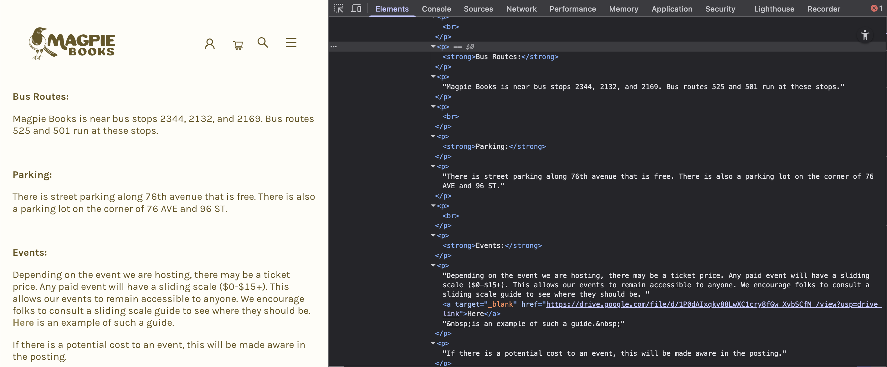
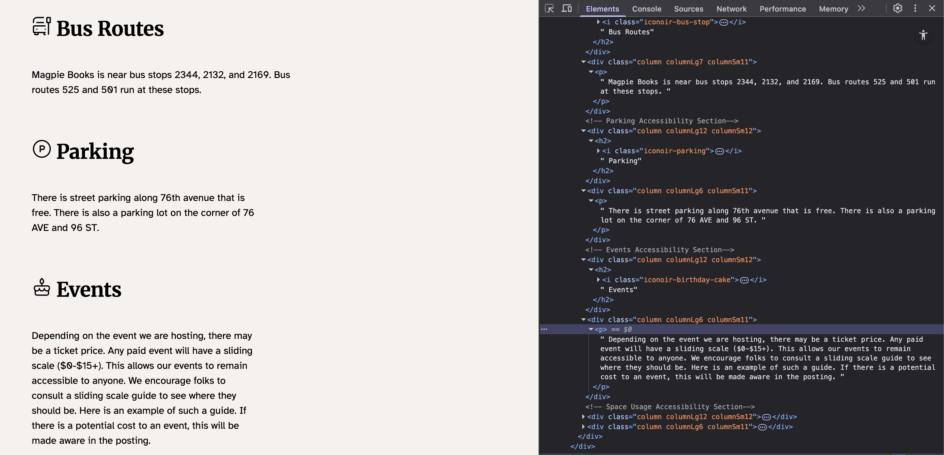
Another good example is the Accessibility page, one of the pages I redesigned. The original used a flat wall of divs with section titles only differentiated by bold text rather than a semantic heading structure. For a screen reader user, that page is nearly unnavigable. I redesigned and rebuilt it using a more accessible design; including a clear heading hierarchy, structured sections, and a more informative layout that makes sense both visually and programmatically.
This was an individual course project with no explicit accessibility requirement. I made it the focus anyway because of what I found when I actually used the site.
Role
Designer & Developer — research, IA, visual design, and all front-end implementation
Timeline
One semester, Winter 2025
Scope
5 fully implemented pages. Remaining navigation links are intentional placeholders.
Tech Stack
Built with
Core
- HTML5 (semantic)
- CSS3
- JavaScript (ES6+)
JS Modules
- carousel.js
- faq.js
- mobile-nav.js
- search.js
- book-order.js
Design
- Figma
- Atkinson Hyperlegible
Approach
- Progressive enhancement
- Semantic HTML foundation
- Mobile-first CSS
Problem & Research
What needed fixing
When I started auditing the site, the problems were hard to miss. The navigation was split across two separate systems with overlapping destinations, and the Browse button didn't work. Without JavaScript, the site wouldn't load at all; and on a slow connection it was nearly unusable. The typography used unstyled platform defaults with no consideration for legibility. For a store with Magpie's values, that gap matters.
Core finding
Magpie Books exists to be a space where people who are often excluded feel welcome. An inaccessible website undermines that before anyone even walks through the door.
If navigating the site makes you feel like an afterthought, that's already the wrong message being sent.
Solution
Key design decisions
Progressive Enhancement
Built the semantic HTML and CSS foundation first. All the core content (browsing books, location, contact, FAQ) works without JavaScript. The six JS modules layer enhanced interactivity on top: carousels, search autocomplete, mobile nav, accordion FAQ, cart functionality.
Single Navigation Hierarchy
Replaced the dual-navigation system with a single header nav; the pattern most users already know.
Atkinson Hyperlegible
Researched accessible typography options and selected Atkinson Hyperlegible — a font designed by the Braille Institute specifically for low vision readers, with exaggerated letterform distinctions to improve character recognition. It also complemented the store's existing visual identity.
Accessibility as Default
Semantic structure, alt text, form labels, and interactive controls are all implemented correctly. The site is set up so that JavaScript enhances functionality rather than being required. Gaps exist: aria-expanded states not wired up on nav and FAQ toggles, the dropdown is currently hover-only, and focus indicators are inconsistent. Those are documented and identified for a future iteration.
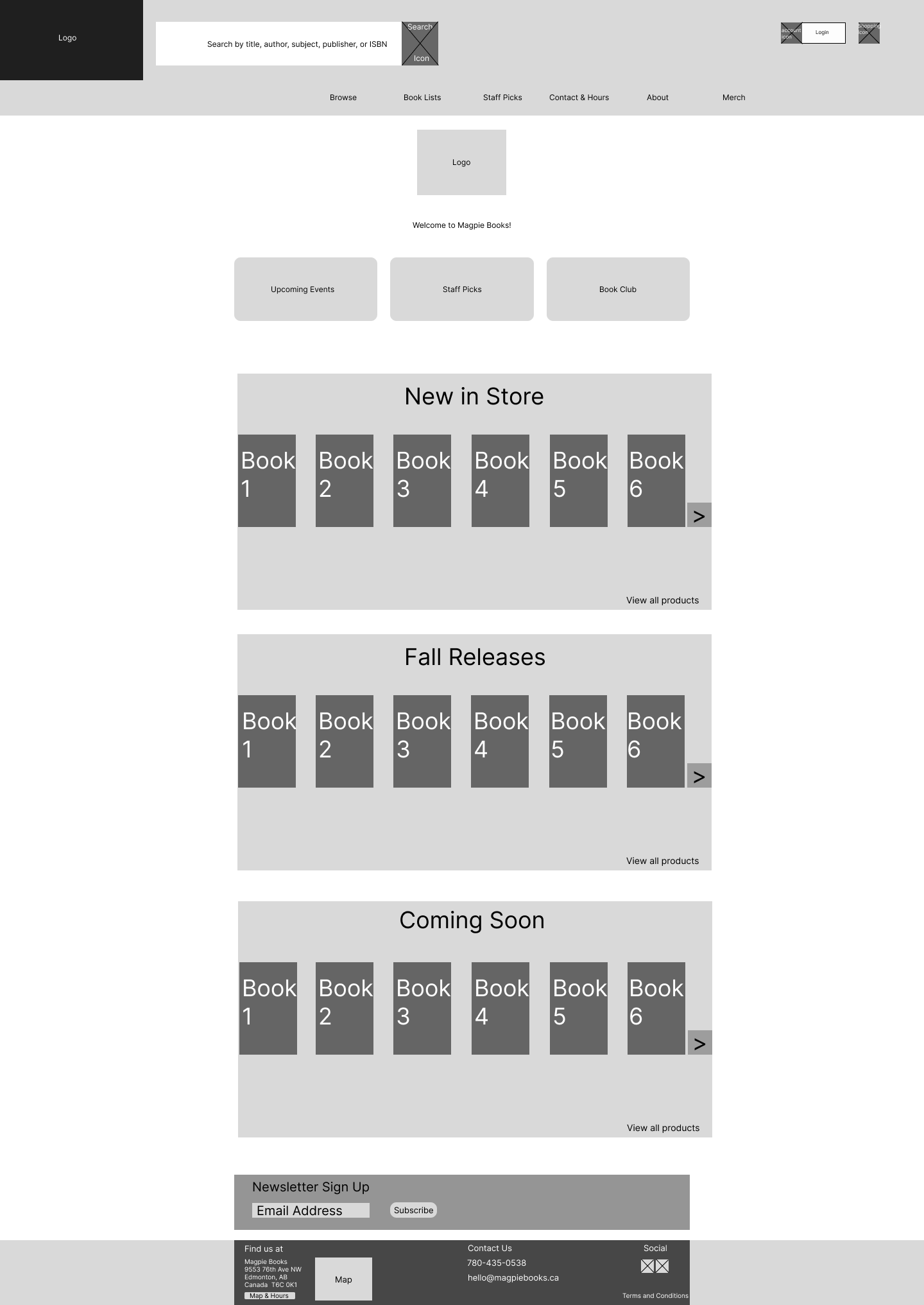
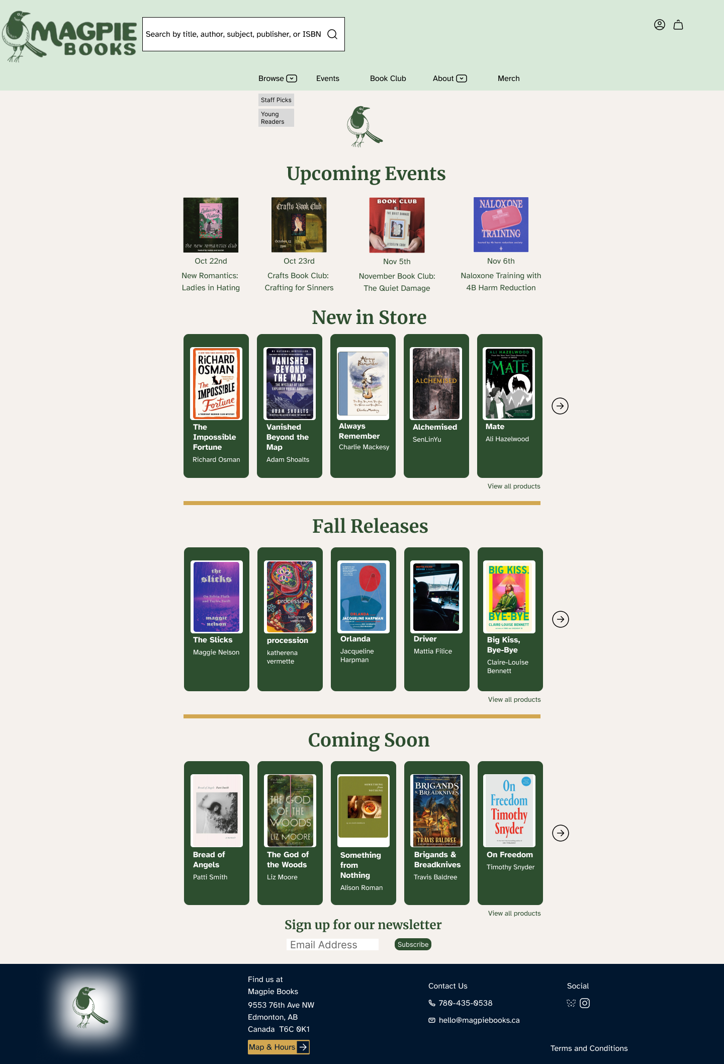
Homepage
Accessibility
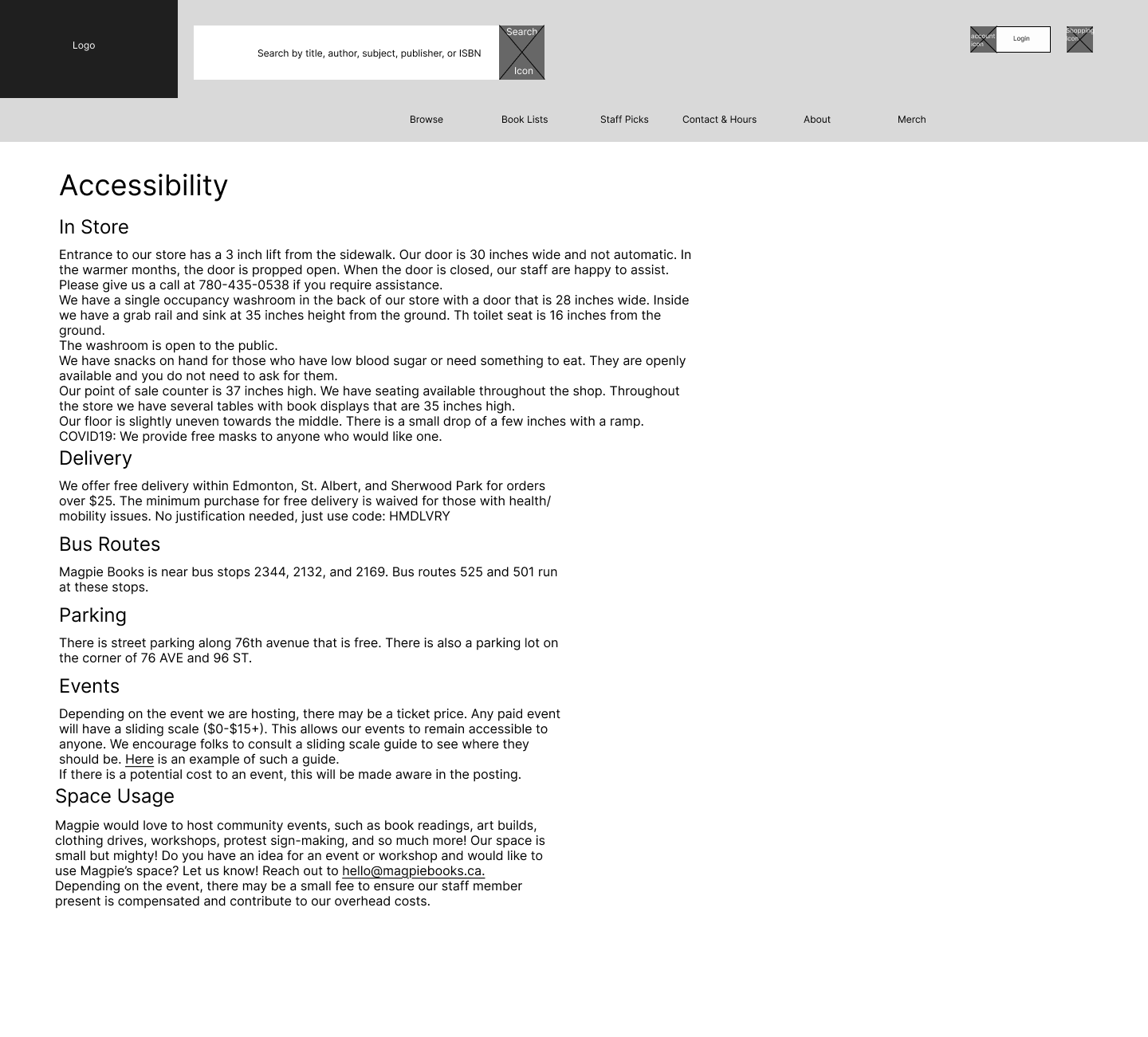
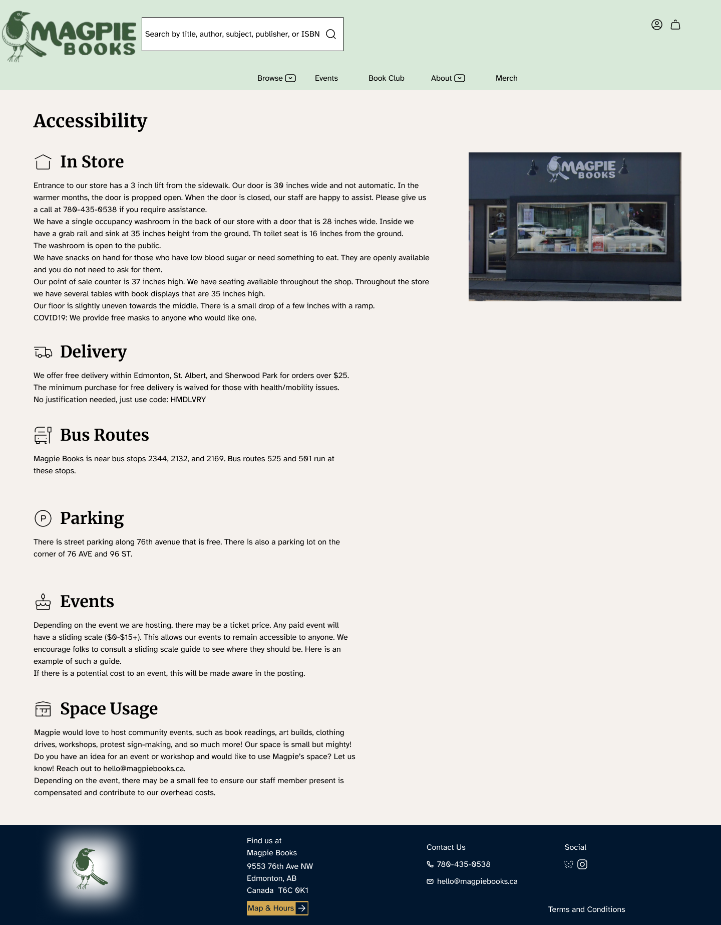
Accessibility — Before & After
Outcomes & Learnings
What came out of it
5 Live Pages
Homepage, Staff Picks, Accessibility, FAQ, and The Invisible Life of Addie LaRue are fully implemented and live. Remaining navigation links are intentional placeholders scoped to the project brief.
Accessibility Built In
Built with accessibility as the starting point. Includes semantic markup, proper heading hierarchy, meaningful alt text, and keyboard-navigable form controls throughout.
The site works without JavaScript. Some areas, like aria-expanded states and focus indicators, are identified improvements for a future iteration.
Progressive Enhancement in Practice
This project was the first time I implemented progressive enhancement deliberately rather than accidentally. Understanding how to layer JS on a solid semantic foundation changed how I approach every frontend project since.
Accessible Typography Research
Discovering Atkinson Hyperlegible through the research process introduced me to accessible typography. Fonts designed not just to look good but to be legible for people with low vision, dyslexia, and other visual differences.
Live Pages