myStudentSystem
Redesign
A redesign of MacEwan University's student portal, driven by survey data and student experience.
Prototype Walkthrough
Context
Background
MacEwan's student portal runs on PeopleSoft which is a third-party student information system used by universities worldwide. Universities stick with it partly because of cost: PeopleSoft automates administrative work that would otherwise take weeks by hand.
Project teams installing PeopleSoft face more than 1,000 configuration choices, and the most successful installations have historically been those that change as little as possible. The result is a system shaped around administrative needs and vendor defaults rather than students.
From the literature review
"On campuses, the most successful installations of PeopleSoft applications have been those that are 'very vanilla.'"
— Olsen, via EDUCAUSE research
The Problem
What the research found
Through surveys with MacEwan students, we identified the scale of the problem before we started designing anything.
of students had a negative outlook on course enrollment
felt overwhelmed navigating the portal
steps required to enroll in a single course
navigation tabs; many redundant, some unexplained
Organization
The navigation was unintuitive. Tabs and pages were not logically named. Related pages were unnecessarily divided. The navbar didn't help you find what you needed. It just linked you back to the homepage.
Access
The most frequently accessed services, particularly class enrollment, were the most complex to reach. Students had to jump between multiple pages to complete basic tasks.
Visual Design
The visual design was basic and didn't use familiar iconography. Excessive use of red created stress and overwhelm.
User Research
Who we were designing for
We developed a primary persona based on survey data and student interviews.
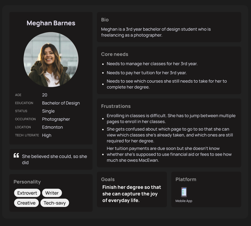
Primary persona — developed from survey data and student interviews
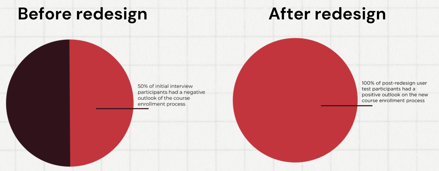
Course enrollment sentiment — before and after redesign
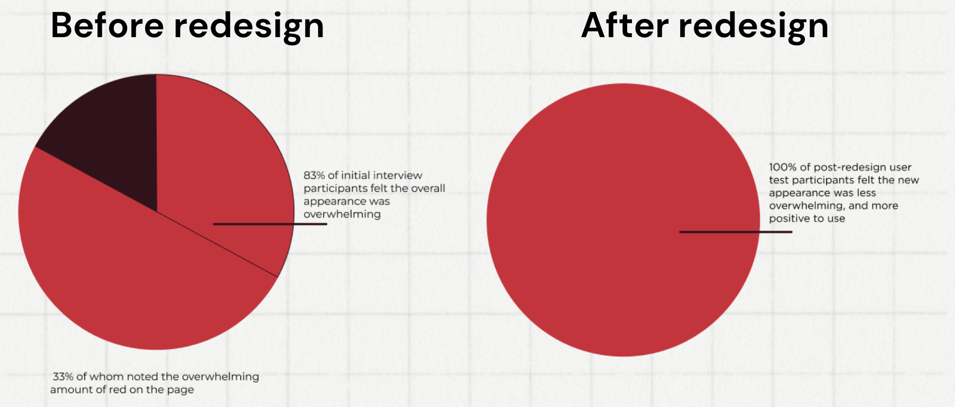
Interface appearance sentiment — before and after
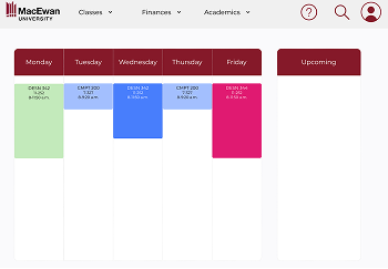
Figma — high-fidelity redesign overview
Competitor Analysis
What's working elsewhere
I analysed three competing student information systems to understand whether switching platforms was a viable option.
Wisenet
Strengths
- Simple, consolidated platform
- All information in a single space
- Easy-to-view metrics
Weaknesses
- Management-focused, not student-focused
- Large volume of information to manage
- Too much hidden in menus
Modern Campus
Strengths
- Native mobile app
- Easy-access accessibility mode
- Easy-to-read course catalog
Weaknesses
- Two settings buttons placed next to each other
- Hard-to-read colour scheme
- Catalog navigation is difficult
Academia by Serosoft
Strengths
- Separate mobile app and web portal
- Simple view of academic content
- Easy offer letter management
Weaknesses
- Information broken across too many tabs
- Some pages are overwhelming
- Sidebar signals importance but gives no detail
Key Insight
The core finding
The competitor analysis made it clear that switching platforms wasn't a viable solution. The alternatives had their own significant problems; and PeopleSoft, when configured correctly, was still the strongest option. The issue wasn't the platform; it was how MacEwan had set it up. Duplicate information spread across multiple tiles, like enrollment appearing in both Academic Progress and Manage Classes, or Fees and Financial Aid split across separate sections, created unnecessary complexity that a better layout could fix.
Solution
How we fixed it
Streamline Enrollment
Reduced course enrollment from 20+ steps to a maximum of 3. Consolidated the course search, selection, and confirmation into a single clear flow rather than multiple page transitions.
Accessible Visual Design
Replaced the stress-inducing red-heavy palette with an accessible colour system. Introduced consistent iconography, and the user's current schedule is visible immediately after logging in, rather than buried three pages deep.
Clearer Information Architecture
Renamed and consolidated confusingly labelled tabs. Merged "Financial Aid" and "Fees" into a single financial section. Brought degree progress and course history into one view. Condensed navigation from 8 tabs to 3 dropdown menus and a profile page.
Outcomes
Measured results
negative 100%
positive
Course enrollment sentiment after redesign
overwhelmed 0%
overwhelmed
Students feeling overwhelmed by the interface
Steps to enroll in a course
Main navigation sections